Tuesday, November 30, 2010

Cadastral Map


Cadastral Maps are used to show land ownership. They were original used for government and tax purposes. 

Accumulative Line Graph


The Accumulative Line Graph, or Lorenz Curve, is most commonly used to show income inequality. It was developed in 1905 by Max Lorenz.

Classed Choropleth Maps


The Classes Choropleth Map shown above depicts the number of Men per 100 Women in 2000 according to the United States Census. The color coordinated map makes it easy to understand in a simple glance.

Parallel Coordinate Graph


 Parallel Coordinate Graphs are able to show large amounts of variable statistics at once.  Each color represents a different variable. A great example of this would be sports statistics. In baseball, each color would be a different hitter and each statistic, a different time at bat.

Correlation Matrix


A Correlation Matrix shows the levels of similarities between variables. This does not look like the common map but is considered to be one. They do not have to be used only for cartography reasons.

Monday, November 29, 2010

Cartographic Amination


Cartographic Animations are extremely usefull because they change in real time. There are several types of cartogaphic animation maps but a great example of this would be the traffic application on an iPhone.

Bilateral Graph


Above is an example of a Bilateral Graph, which gives both positive and negative values for at least two variables. The example given depicts trade deficits with China in the past four years.

PLSS maps

 
This Public Land Survey System, also known as PLSS map, is of the state of Alabama. The upper corner is Franklin, AL, highlighted in blue. This type of map is also referred to as the rectangular survey system. This was the first mathematical system of mapping.

DRG


DRGs are more commonly known as Digital Raster Graphics. This is a scanned map that usually has very high resolution.

DLG


 A DLG (Digital Line Graph) that are formed from other U.S. Geological Survey (USGS) maps and distributed on 3 different scales. The map above is a large scale representing different transportation routes.

Sunday, November 28, 2010

Digital Orthographic Quarter-Quads (DOQQ)


Images taken from a camera mounted on the botom of an airplane, these DOQQs are basically aerial images that are georeferenced and orthorectified.

Isobars


Isobars are basically lines that connect similar air pressure, in turn forming circular images on a map.

Infrared Aerial Photograph


This is an example of an Infrared Aerial Photograph. This map of Onondago Lake in the Syracuse shows how infrared photographs pick up a slightly more detailed image than the human eye due to wavelentghs outside of our range.

Black and White Aerial Photograph


This is an example of a Black and White Aerial Photograph.  Aerial photography gives us the ability to see a detailed image of the given location. This gives about the same amount of detail as the human eye.

Proportional Circle Maps


A Proportional Circle Map is just that. The example above shows a proportional circle to the number of Mexicans per state.

Dot Distribution Map


Above is an example of a Dot Distribution Map. This map is purely a visual tool and is not the most accurate. Dot Distribution maps are often seen on site such as Yelp.com and store webites to show the amount of stores in your area.

Choropleth Map


A Choropleth Map is an example of a thematic map. It shows specific information without distorting the basic geographical shape of the location. Above is an example showing males per 100 females during the United States 2000 census. 

Thematic Map

 
Thematic Maps are used to show specific  information without distorting the given geographical location. The example above shows the time zones of the United States but thematic maps are not limited to this type of information. Choropleth, Isarithmic, and Dot maps are all examples of thematic map making.

Propaganda Map


Propaganda Maps are used through out history but are noticed mainly at times of war; this is when maps are used as a symbol of power. The image above is from the Japanese before the 1905 Russo-Japanese War, showing Russia as the “Black Octopus.

Topographic Map


Topographic Maps show both natural and man-made details. These maps make it easy to see where the is room for development or change in a certain location. These maps are usually an accumulation of several topographical surveys of the location.

Doppler Radar


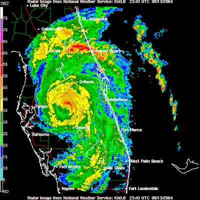
Doppler Radar is used to show the weather over a given area. We see Doppler radar images used daily in our local weather forecast as well as online programs. Doppler radar is also used in aircraft's and Police speed guns. For the well known weather map version, microwave radiation is released in waves from a Doppler radar station, allowing the station to, in turn, receive information for the image.

LIDAR


A Light Detection And Ranging map, otherwise known as a LIDAR, gives us the evelation or any given area using laser technology.  Using short wavelentghs, LIDAR uses reflection to give us a 3D view of a location, making it easy to see any changes in the area.

Population Profile


source

This in an example of a population profile, showing the the immigration into the United State in 2004. It breaks up the immigration into gender and age. Profiles such as this one help the country estimate population and funding distribution.

Windrose


A Compass Rose was original called a Wind Rose.  It is now used to track the winds over a period of time enabling us to predict the weather.


Digital Elevation Model (DEM)


The DEM shows a representation  of a geographical locations terrain. Above is a pretty basic representation of the United States' land. DEM can also be referred to as digital terrain model (DTM). DEM shows a more naked version of the Earths elevation and texture, rather than the Digital Surface Model or DSM which includes roads and buildings.

Saturday, November 27, 2010

Flow Maps


A flow map is a perfect mixture of a flow chart and a geographical map. This gives us the ability to keeps records and visualize movement over the earths surface. The map above is an example of the migration in the Netherlands in 2007.

Scatter Plot


A scatter plot is a graph that we become familiar with starting in early math classes. It is "designed" by plotting multivariate values. This particular scatter plot is a visual for the Pythagorean triple. Other scatter plots may be used to show basics such as how age effect the amount of "best friends" you have or even crime vs population.

Star Plot


This is an example of a star plot. I decided to use an older star plot example mainly because I think it is beautiful. A star plot shows us where constellations are located. This map breaks the nightly location of the stars up based on the northern and southern hemispheres.

Mental Map


This image is the perfect description of a mental map. Mental mapping is a basic and key form of cartography that we use on a daily basis. Mental Mapping is how was save information in our brain, giving us either memories when a location is mentioned or even getting ourselves somewhere based on "autopilot".